Most of my work from the last decade hasn’t made it on to my website. But some of it is online at http://bbf.myportfolio.com
Large Hadron Collider & CERN Laboratory images
Posted in Uncategorized on October 9, 2013 by brynforbes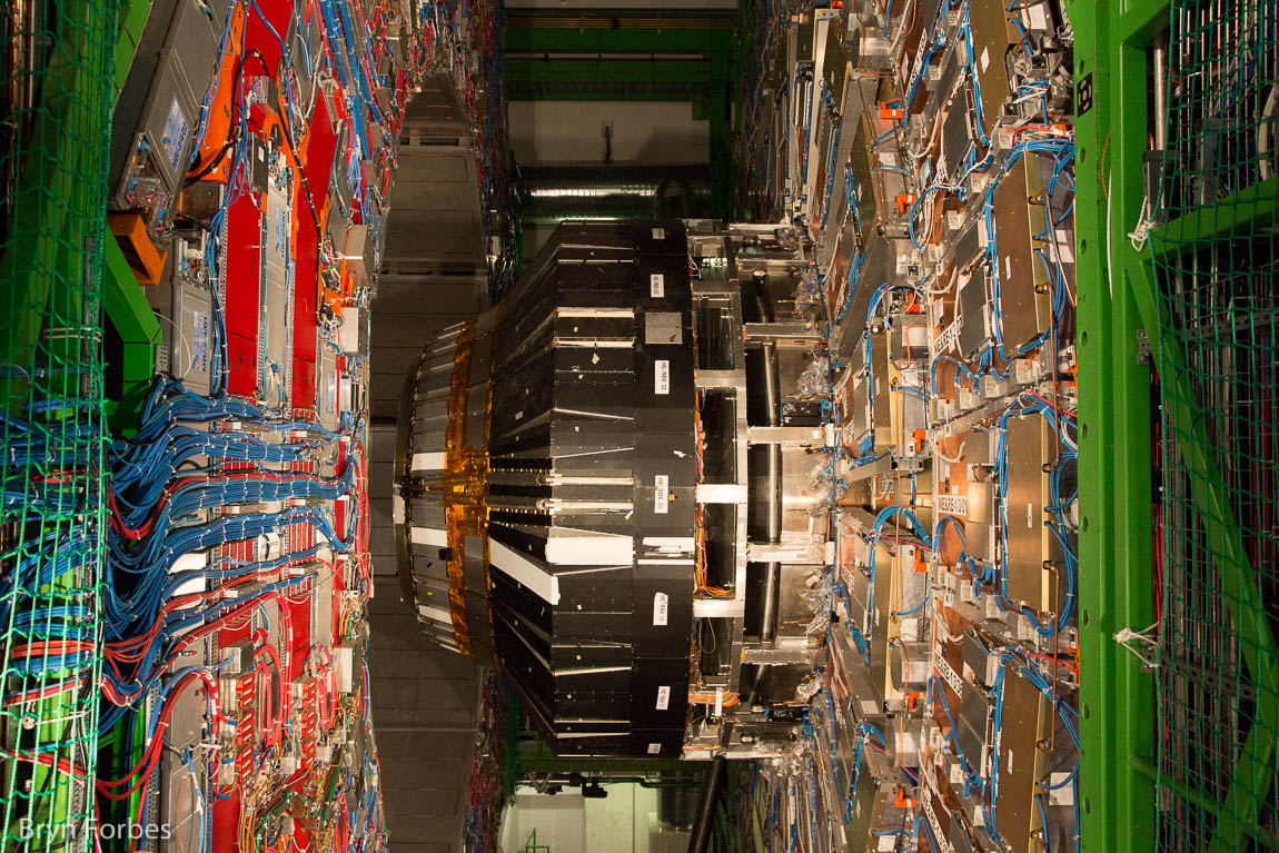
I had the awesome opportunity to photograph CERN Laboratory and the Large Hadron Collider. The image pictured is of the CMS detector, part of the experiment that proved the existence of the Higgs Boson, a particle which gives matter mass.
Photos are at http://brynforbes.com/galleries/cern
Abstract art derived from photos are at http://brynforbes.com/galleries/cernabstractions
How do you (literally) see the world?
Posted in Uncategorized on August 15, 2013 by brynforbesMost photographers will tell you that a 50mm lens is the human eye equivalent. Further proof that I’m not normal. When I look through a viewfinder and then take the camera away quickly and back, or alternate closing one eye, 50mm doesn’t match how I see. Do things seem closer or farther away to you than a 50mm lens?
When I took my pilot’s license medical exam, they had a system of testing your peripheral vision. basically something would slide in to view and you’d have to note when you could see it. The doctor remarked I had unusually wide angle field of view.
Perhaps this is why I like to print so huge. a 40″x60″ piece seems so much more full of life to me. I can live in the image longer, and appreciate it more fully. I’m also the guy that doesn’t mind sitting in the front section of the movie theater (though I do get a crick in my neck if too close).
Maybe that explains the 138″ video wall I built, the 4 foot by 7 foot lego mosaic, and the desire to get this denali picture printed 20 feet wide (it is a composite of over 600 images so there’s enough detail to do it!)
Am I just falling in to the trap that bigger is better or does how I see the world change my artistic stle? Chime in with your comments.
![denali_D5C1914__D5C2115-177-images-[Group-4]](https://brynforbes.wordpress.com/wp-content/uploads/2013/08/denali_d5c1914__d5c2115-177-images-group-4.jpg)
How fast do auroras move?
Posted in Uncategorized with tags aurora, aurora borealis, northernlights, rora, shutter speed, solar storm on August 6, 2013 by brynforbesI’ve always wanted to see the Northern Lights. Before Iceland I had only seen a slight glow in the sky of Alaska. There are lots of timelapse videos on the internet but it’s hard to get a sense of speed given they have sped up the video so fast. My brother in law was also curious about how fast auroras move and asked me to get a real time video. I wasn’t sure whether I’d be able to given I didn’t know how bright they’d be. You have to have a shutter speed of at least 1/30th of a second to shoot video which is 900x less light than most of the 30 second exposures you see of auroras. But I gave it a shot. I cranked the ISO all the way up and used the fastest lens I could rent on one of the best low light DSLRs currently made. Here’s one of the clips I shot of a pretty large solar storm hitting the earth. I saw it dance and shimmer faster than this a few times and slower than this a lot.
Real time Aurora video – Iceland 2013-03-17 from Bryn Forbes on Vimeo.
What verbs come to mind to describe the way it moves to you?
Better to split up?
Posted in Uncategorized on May 18, 2013 by brynforbesNormally I think of diptychs and triptychs (of the same photo) as a solution for making larger pieces than a printer can print. However, a customer asked me if I could do a triptych of my lakeshore image at a size that I could print a single piece at, so the split would be purely aesthetic. I have to admit I was skeptical, but I’m actually quite pleased at how it came out. I compensated for the gaps in the images so the lines in the image continue without jumps. What do you think? Do you prefer one of the triptychs or the original?

one reason not to delete photos
Posted in Uncategorized on August 1, 2011 by brynforbes


I was at a talk at Charles Hartman’s gallery a few months back with Julia Dolan, curator of Photography at the Portland Museum of Art. The discussion turned to what to do with photos after your death and some photographers in the audience were of the mind to “burn the negatives” so no more prints could ever be made. Dolan suggested the importance of them being willed to a photographic preservation trust with the instructions to be used only for academic study, because it’s very interesting for researchers to see the process by which a photographer works. Do you shoot a wide establishing shot, then pace around from different angles, only to end up shooting the flower from underneath? or was it the first shot you saw that was the winner?
So just in case you become famous, buy another 3TB hard drive and save those “good” “adequate” and maybe the terrible ones too. Drive space is cheap and it often costs more time to dither about which to delete than it does to deal with storing more files. Or just clean everything out, make history think you only ever took great shots and make it easy to find those great shots. Not that you’ll care as you’ll finally be catching up on sleep after a lifetime of photographing sunrises :)
is good worthless?
Posted in Uncategorized on July 31, 2011 by brynforbes With the official totals for my recent trips hovering around 38000 and 40000 images, I find myself despairing over how many “good” photographs I have. Around every corner in venice is a beautiful scene with a canal, a building that is slightly off kilter being held up by petrified wood piers, some beautiful flowers in the flower boxes (I think about 20% of Italy’s GDP is spent on flowers in windows ;) ) However, with such similarity it’s hard to pick out which if any, are “great”, which means to me, that they aren’t great. A great image leaps out at me and grabs me by the lapels (Perhaps my problem is that I’m wearing tshirts while editing my photos which don’t have lapels). In wildlife photography, there’s so often a decisive moment, the lion leaping the river, or the kingfisher caught midflight, that says THIS ONE. Although as a counter point, I have a lot of lion images from africa where they are just sleeping, that are “good”. So again I’m faced with what do I do with the images that are nice, that collectively help to tell the story of a place but aren’t going to be featured in the gallery. In a world that has so many great shots, my good shots are competing for the ever shortened attention span against images that probably have a whale breaching in one of Venice’s canals. Of course these “great” images might not represent that slurry of tastes and sounds that embody a trip to venice, because they are so apart from the normal.
I think the good vs. great tension is present in our lives as well. How do we savor and appreciate the good moments in our life, when the media is only talking about the great moments the celebrities are having? Does hearing about the royal wedding diminish the memories of weddings we’ve been to? I hope not, though I fear that the age of omnipresent information allows us to compare ever present good against a presented great. Even the great moments in our lives when patched together would make an impressive slideshow, but would present a wildly inaccurate story for posterity, as I think the good moments in my life are much more me.
jet lag
Posted in Uncategorized on May 23, 2011 by brynforbesSitting on a bed when your body thinks its 3am is like an alcoholic sitting in a bar.
Once you’ve bargained with yourself that a short nap won’t hurt your adjusting to the local time the first thing to go is your inhibitions to snoozing or resetting the alarm for just another hour more. You may get woken up by the hotel staff who don’t expect you to be sleeping at that time of day. You slur your speech and say anything to make them go away and return to that siren call.
If you can’t tell, I caved and slept for a few hours after arriving here in Johannesburg this morning on a +2 days set of flights from Portland, Oregon. I suspect I’ll still be able to sleep tonight, then it’s off early to the lands of no internet. Catch y’all on the flip side.
tourist or local?
Posted in Uncategorized with tags attention span on May 20, 2011 by brynforbesFollowing up on the previous post, who should I as an artist be spending my hours working for? The person that walks by with little context or background, that I have to grab in 30 seconds? The art critic that has seen it all before and dismisses the simple, desiring the meaty layered message with depth and requiring knowledge of references and context? the sophisticated connoisseur that is somewhere in between?
In the front of my gallery I have a big wall of monitors that I have been exploring how best to use.
Three paths
- BEST OF THE BEST — Do I have it rotate my top 20, so people walking by the first time are guaranteed to see the best of the best, in order to increase my chances of getting them to stop and come in?
- WIDE VARIETY — Do I have it rotate my top 200 or 500 so the people that live locally always have something new to see, and incentivize them to come by more often at the risk of not having the best work for the tourists?
- FLASHING NEON — Or do I go stroboscopic, moving stuff around, flashing HEY YOU, and other such eye searing vegas like tactics? No no I won’t. I just add it here for discussion.
In the social media world, do we blast our message repeatedly trying to get the people that only check facebook/twitter occasionally at the risk of repeating ourselves over and over alienating our most loyal readers?
The tourist or local quandary is an analogue to the attention span quandary, I wrote about in the museum. Do we play to get the simple message to many or the complex message to a few?
I think the answer is a personal one for each of us. Are we looking for fame/notoriety? respect? some sort of validation from the critics/experts/nobel committee? is it purely a financial data model waiting to have its tables pivoted and the maximal revenue path spit out? If so, I suspect the answer depends on the price of our goods/service. The lower the cost the more slanted towards the flashing neon lights, because you require volume, and impulse purchases don’t have a high threshold to get over. Though its true that if you throw enough monkeys at a typewriter farm, or darts at a dartboard, or social media posts at a vacuum, you increase your chances of finding that person that’s interested in a deep purchase, you also alienate many deep purchasers in the available pool.
Perhaps the solution is a layered approach. Have some part of your message by shouting from the rooftops, and another part of your message be a million volume library of careful consideration.
But seriously, should my video wall be TOP40 or DEEP TRACKS?
attention span TENSION (museum visit)
Posted in Art with a Capital A, observation on May 19, 2011 by brynforbesWho are you aiming at? I was recently in the Montreal museum of contemporary art. I walked in to a dark room, so dark I couldn't see if I was going to bump in to somebody else. A video was projected on the wall. At that moment it was a scene of a beautiful river somewhere, then a cowboy riding a horse slowly crossed in to the frame and out. It was peaceful, and I stayed a little bit longer to see if there was something more. There didn't seem to be and I left. We are a culture of skimmers. I've probably already lost the attention of many of you reading this. BULLET POINT! : ART IS LIKE EVERYTHING ELSE. If we want viewers, we have to play to the fact that they have other things to do, other pictures to look at, growling stomachs, and wandering minds. However, that desire for viewers, CHANGES THE WORK!. That video would surely have been different. At it's most extreme it'd be the Bourne movies where no camera shots lasts for more than 1.4 seconds (EXAGERRATION!) In walking through the museum I saw things I didn't get that were seemingly complicated and I chalked "not getting it" up to my lack of knowledge of art or context. There were simple things that I "got" but also "didn't get" (as i thought I understood the message but it didn't have any bearing to me or emotional appeal) and I saw some things that did resonate. One was a pair of curtains hanging from overly large hula hoop esque things that formed circles, that twisted slowly back and forth sending the curtains outward a bit, which reminded me of young girls at play, twirling, spinning their dresses. Too me, the take away was whimsy. I watched for a bit, perhaps not all that much longer than the video but I left satisfied, whereas the video I felt like I let the artist down by not staying to perceive the entirety. NEW PARAGRAPH SUBJECT! : VIDEO THAT CAUGHT ME Further along in the exhibit hall I came upon the video installation "Soliloquy" 1999 by Shirin Neshat. I walked in, two screens playing two videos opposite each other, clearly connected. In the first 30 seconds, I saw a woman staring at my one screen and seemingly a very similar women walking in a very different world in the other. The womans eyes staring back were completely arresting. There was a hint of a story too -- the woman looking back over her should from time to time. My normal video installation attention span having lapsed I stayed to watch. It turns out the two videos are the same woman with some plot, no dialogue, one set in an arabic architecture and the other in a more western architecture. I was intrigued by the similarities, and when to be looking at which screen, and the architecture, and the questions, what's going on? where is she? I sat down and watched all the way through loop beyond where I entered. ALL CAPS SHOUTING - WHERE WE ARE IN THE BLOG POST! = I RETURN TO THE VIDEO THAT DIDN'T GET ME Having found such rare interest in a video installation, I decided perhaps I should return to the video that I didn't get and watch its entirety, give it a fair shake if you will. It did have something I didn't see the first time, the cowboy sits down and sings a song that clearly was tied to the title of the piece and clearly embodied much of the message to the viewer. Then some more peaceful river scenes. It was pleasant, but certainly not gripping me by my lapels. Perhaps if I needed a calm moment the piece would have appealed to me more. WHAT I LEARNED (well at least something that I think I learned) Clearly one video was more compelling to me, and I suspect the other visitors agreed. So as an artist (or a blog post writer) tailor what I'm about or at least sprinkle in compelling aspects, in order to grab the average viewer. Should I have mystery? Do I need story? what if I just want to make a pretty picture of the ocean? Did the director of the more compelling movie intentionally add these aspects so as to connect with more people? ROLE OF THE ARTIST How important is it to reach lots of people? i.e. what good is it, if your message only reaches a few people Is it more important to me to please the sophisticated critics and lose the masses? i.e. is it too costly to me/the message/the work to have the broad appeal? CONCLUSION? I feel I am in the middle with lots of questions. I have many works that I think of a simply elegant and can draw the viewer, and let them float in the visual waters, but the message isn't a deep one trying to effect social change. I have pieces that are steps in either direction away from the middle. Pictures that are more appealing such as a flower, or that are more about a specific message or intention. Hopefully I'm still many steps from the banal, and far from the overly complex Art with a capital A looking down its nose at the people that don't understand. Yet I'm still feeling like both are tied to my wrists and pulling me down two opposing drag strips. I DON'T HAVE MORE TO SAY AT THE MOMENT SO -> END.
